Tuesday, 16 April 2013
Tuesday, 26 March 2013
Evaluation 7
Looking back at your preliminary task, what do you feel you have learned in the progression from it to the product?
Evaluation 6

What have you learned about technologies from the process of constructing this product?
To edit our thriller we used a programme called Final Cut Express. On this programme I learnt how to capture footage's from a digital camera and how to drag and drop them bit by bit to create and actual film.
On the editing aspect tour film I learn how to use different tools and arrangements in order to make it as fluent and effective as possible. Whilst making this thriller i learnt how to use add effects, some of the effects we used in our thriller were cross fades; you can see this number of times in our thriller mostly from the transition from a clip to titling. This is very effective in building tension steadily as the film progress making it more engaging to watch as the audience anticipates what happens next. In Addition we also decreased the levels of duration to make curtain clips look as if it is in slow motion making it more thrilling to watch. We also learnt how to arrange different lengths of clips onto the timeline effectively by merging them in the right order so that the film flows and makes sense.
During parts of our thriller we made cuts in order to place our titling. For our titling we used a separate programme called live type. In this programme we were able to edit our titling by being able to change the background, style of writing and add special effects to make the titling appear in a more eye catching way. We effectively used this to our advantage as changed our style of writing to a more horrific and sharper form in order to make it more applicable to our target audience and fit with our film genre. Furthermore we also added a special effect in our titling as it appeared on a black background in a more fancy and attractive way to keep the audience engaged. We also extended the duration of the titling on the timeline to make it appear on the screen for longer as it gives the audience more time to read what is on display.

To actually record our film we used a digital camera. This was extremely easy to use as everything was placed in position as it was digital making the recording phase easy, all the buttons on the camera stated what they were for so were able to rewind and playback our footages with no problem. We also learnt how to use a tripod which we used to keep the camera still whilst recording, this was very easy to use and extremely effective in making our recordings look professional and precise.

Before making our thriller we used a survey programme called survey monkey to assess and find what the people think about thriller films and how we can make our thriller as effective and appealing as possible by using our results to find out aspects that people like and don’t like another thrillers. Learning how to do this was very easy as the website is straight forward to understand, however I found this process long and time consuming but when finished the results then placed in a graph making it easy to understand and use

We also learnt how to use the website ‘Blogger’ which we used to document our coursework which also consistent of research, ideas, and planning information for our thriller, for an example Survey Monkey results before we actually made it. This website is also very easy to use as it is very similar to using the programme Word PowerPoint which anyone could use.

Evalution 1
In what ways does your media product use, develop or challenge forms of conventions of real media products?
As you can see in my thriller there are ranges of convention in which was used that made it a typical thriller. One of this was the cliff hanger at the end of the opening as the scene cuts just before the innocent girl was about to get grabbed. This is a typical thriller element as it is also present in several other real thrillers such as one of the thrillers we watched in our media lesson called North By North-West, the part where Eve and Thornfield are literally hanging off a cliff.
Another typical thriller element which is evident in my thriller is a red herring. This can be seen as one of the female character Sarah was told to meet someone who apparently wanted to give her back her mobile phone which be found on the street, as the girl arrives at his house where she was expecting him to be in she instead finds the door open with no trace of her phone or anybody inside, until the end of the opening meaning she was falsely lead. This is a typical thriller convention as it can be seen in real thriller such as The untouchables, one of the characters named Elliot ness was given information on a warehouse that is storing Al Capone’s alcohol, the treasure department then surrounds then warehouse and break in, inside the warehouse there is no trace on alcohol found, the audience had been falsely lead to believing something.
Another thriller convention we used was the theme; directors of thrillers tend to base their themes around creepy, dangerous and frightening real life events in order to be able to relate it with the audience which enhances the level of fear. This can very much be scene in our thriller as we based it around the subject of murder/crime as after a series of events the protagonist is located in a house with only her and two antagonist. This is also the case with real thriller films such as ‘The Batman’; one of other themes in this thriller is crime. This is very similar to the theme for our thriller.
Another Convection which we used was lighting. In the phone call conversation between the girls and the stalker we decided to make the stalkers surrounding extremely dark shadowing the stalkers location, we made the light from the phone to be the only light source in the room with displayed a bit of the stalkers face and shadowing the rest. This was highly effective in making the stalker look more creepy, dangerous and anomalous. Whist in contract to this this on the other side of the phone was the girl who we put in a well-lighted room making her face and background visible. This is effectively in emphasising her innocence due to the contrast in lighting. This aspect can also be compared to an actual thriller film such as The Batman again
As you can see in my thriller there are ranges of convention in which was used that made it a typical thriller. One of this was the cliff hanger at the end of the opening as the scene cuts just before the innocent girl was about to get grabbed. This is a typical thriller element as it is also present in several other real thrillers such as one of the thrillers we watched in our media lesson called North By North-West, the part where Eve and Thornfield are literally hanging off a cliff.
 |
| My thriller 'The Stalker' |
Another typical thriller element which is evident in my thriller is a red herring. This can be seen as one of the female character Sarah was told to meet someone who apparently wanted to give her back her mobile phone which be found on the street, as the girl arrives at his house where she was expecting him to be in she instead finds the door open with no trace of her phone or anybody inside, until the end of the opening meaning she was falsely lead. This is a typical thriller convention as it can be seen in real thriller such as The untouchables, one of the characters named Elliot ness was given information on a warehouse that is storing Al Capone’s alcohol, the treasure department then surrounds then warehouse and break in, inside the warehouse there is no trace on alcohol found, the audience had been falsely lead to believing something.
 |
| The untouchables |
Another thriller convention we used was the theme; directors of thrillers tend to base their themes around creepy, dangerous and frightening real life events in order to be able to relate it with the audience which enhances the level of fear. This can very much be scene in our thriller as we based it around the subject of murder/crime as after a series of events the protagonist is located in a house with only her and two antagonist. This is also the case with real thriller films such as ‘The Batman’; one of other themes in this thriller is crime. This is very similar to the theme for our thriller.
 |
| My thriller 'The Stalker' |
 |
| The Batman |
Another Convection which we used was lighting. In the phone call conversation between the girls and the stalker we decided to make the stalkers surrounding extremely dark shadowing the stalkers location, we made the light from the phone to be the only light source in the room with displayed a bit of the stalkers face and shadowing the rest. This was highly effective in making the stalker look more creepy, dangerous and anomalous. Whist in contract to this this on the other side of the phone was the girl who we put in a well-lighted room making her face and background visible. This is effectively in emphasising her innocence due to the contrast in lighting. This aspect can also be compared to an actual thriller film such as The Batman again
 |
| The Batman |
 |
| My thriller 'The Stalker |
Saturday, 23 March 2013
Tuesday, 12 February 2013
Creating titling sequence

This is a screen shot of the programme LiveType which was i what i used to create the titling for our thriller 'The Stalker'. I took full advantage of this programme as i used the effects and style, size and positioning of writing font so that it is suitable for the theme of our thriller. As you can see in the screen shot above there are side bars with drop down lists to pick what type of effect you want your titling to have which i used as a chose the most effective one suitable to the theme for our thriller. In the screen shot above you are able to see two lines which are yellow and purple, by using my mouse to drag the end of the lines i was able to change the duration and the pace of the effect for the titling which i changed as i made the lines longer resulting in the titling appearing much slower which is effective as it gives the audience times to process the written words and see them clearly, it also contributes in building up tension. I made sure that i kept this effect and font consistent with all the titling, the only thing changed was the size as i made the title of the thriller 'The Stalker' slightly bigger than the rest of the titling. This is to keep the titling simple, organised and flow throughout the footage also if the effects and fonts were different it would draw too much attention which is not needed as the actual footage is the main focus not titling.
Titling
Format of TITLES for AS Thriller Coursework
After the IDENT use a FADE IN. The titles should then be in the following order:
(1) 'Your Production Company' Presents
(2) A Film by 'One name - usually the director'
(3) Starring or With
(4) Male star
(5) Female star or other way round
(6) Title of film - or could be at the end
(7) Also starring - 2/3/names - each on seperate title
(8) Then 3/4/5 of the following - you choose - each on seperate title
Editing
Music
Cinematography or Director of Photography
Casting
Set Designer
Costume Designer
Script
(9) Then Producer(s) - can be more than one
(10) Always finish with Director - one name, usually the same as A Film By ...
(11) Could put title here
Remember to use LiveType and try to make titles interesting. They can be either over black or superimposed over your film. Space them out over the two minutes of the film.Give the audience plenty of time to read the titles.
(12) Finish with a fade out & fade music out
Thursday, 7 February 2013
Editing

This is a screen shot of the editing for our final thriller which was done on the program Final Cut Express. For this being my first attempt in editing i would say a substantially good amount of editing progress has been made as i have managed to place the footage's recorded in an organised order and erased some of the unwanted parts. I also used the 'Effects' option at the top of the page to fade in and fade out some of the clips in order for it to flow
Rough Cut
Because of the better weather me and group went filming on sunday and managed to get some of the shots which we could potentially use for our overall footage. This filming time we had was very usedul as we managed to get around half of our footage filmed which we need some editing improvements which we will immedatly attend to in our lesson on Monday. With the success of some of the footages we managed to film there were also some improvents which we could have made during our fimling session. With some of the footages the camrea is not very steady which can be seen in parts throughout our footage, ths will need to be improved and cut out otherwise it would make our overall footage look unprofessional which we will make sure not to do during our next filing session. Another improvem,ent we will need to take is the aspect of the lighting, this needs to be brighter at some pionts in the footage which we will also ensure to improve in our next filing session otherwise peopkle would stuggle to see our footage and would also cut out the parically blind audience. A further improvement we would need to make is adjustment of the background noises as tey do not correspond with the footage and is unwanted. However this can easily be dealt with when we are editing as we can simple mute the unwanted noises. Overall our filming session was a sucess as we have managed to film part of our thriller and will only need some editing and adjustments.
Tuesday, 5 February 2013
Casts for 'The Stalker'
 |
| Leading actress: Sarah Mboso as 'Sarah Fonten' |
 |
Starring Nicholas Ahorituwere : 'The Stalker' |
 |
| Starring Seye : as 'David Cruise' |
 |
| Directed by: Dapo Awofolu |
 |
| Starring Akua Ntiamoah : as 'Alisha Clayton' |
Animatic for 'The Stalker'
This is the animatic for 'The Stalker'. It contains pictures of each block in the storyboard. This helps to tell the story in the form of a brief plan, with the help of short annotations between images.
Tuesday, 29 January 2013
The Stalker Trial
Because of the bad weather as it snowed we were unable to go out filming so i our last media studies lesson me and my team did a trail run on different angled shots for the first scene in our opening thriller which consisted of the victim Alice dropping her phone accidentally as she walks home. We filmed this indoors and after many times of shooting we decided that the birds-eye-veiw shoot was the best angle as it was the most effective because we could see exactly what was going on through out the scene which we thought was the best way to start the film. This sunday we have decided that we will go out and start our actual filming, we will then evaluate our filing on monday and edit it to make it more suitable.
Thursday, 17 January 2013
Title Sequence
The production company for James Bond: Casino Royal was made by MGM studio which is a filming industry based in Hollywood. The titling starts of by stating who the producer of the film is then followed by the led actor, the name of film is then followed. The titling then ends with the director of the film which is same case the majority of other films. The titling for this is written above the video whilst playing making it more eye catching and interesting to watch as some titling sequences are written on a plan background which viewers may not pay attention to as it is boring. It also gives the film a continuous flow as it the screen does change into a blank screen of any such went the titling is being displayed. The titling is also written in a very basic font which is affective as it make it extremely clear for the audience to read as it is very clear. This font is also affective as it doesn't draw too much attention to it as if the font was more eye catching then the audience would pay attention to it that the video going on in the background. This is also good as it doesn't give away ideas to what the film may contain which is effective as it keeps the audience interested as they'd want to find out what the film is about. In addition to this the font is written in small, this is so that the titling does is visible by the audience but at the same time it is not interrupting the video. The titling has also been spread out on different clips of the video as it goes on, this changes the background scenery of the titling as it progress which is good as it keep it entertaining to watch rather than it all been viewed on the same continuos background.
The production company for SpiderMan was made by Columbia studio which first appears in at the beginning of the film which is common with others films as the production studio is always the opening. The titling starts off by displaying the films sorcue of prodcution which is from the Marvel enterprises which are higly known to produce comic book films. This is followed by the name of the film then the led actor then the other actors and actresses in order of imporantce. The font of the titling is in a unique and attractive font which is eye catching for the viewer. The style of the titling matches the concept of the film as it is written in an un orderly way making it look more mysterous and spooky. The background is also effctive as it corresponds to the theme of the film as it dislplays different forms of a web as it titling chnages, this is good as it gives the audeince an idea on what the film will be about but it doesnt give too much aways. ASs the titling progress more and more about the is giving away bit by bit as glimpses of the main superhero 'Spiderman', the villain 'Goblin' and some of the settings of the film starts to be displayed in the background of the titling. This is effetcive as it builds up towards the actual film. The titling ends by stating the producers of the film followed by the screen play then finally the director.
The production compnay of this film 'Final Destination 5' is by one of the worlds most known studios 'Warner Brothers' which is displayed at the start of this titling for this film. The production line of this film is displayed at the begining of the title sequnece which is very common in films, this is then followed by the name of the film and then the actors and actresses in order of imporance. The font of the titling is very basic similar to the font for James Bond: Casino Royal, the only differnce is that the font for this is bigger and displayed in the middle which is a more obvious place making the titling the centre of attention in the opening. The background also gives glimpses to what the film is about which is effective in giving the audinece an idea on whats to come. The effects used when dislaying the titling is also effective as the titling looks as if it is getting closer and closer to us when being dislpayed, this is highly effective in catching the viewers attention and emphasises the importance of the titling. The titling is finished by stating the producers of the film, then the writer and finished with the director.
Monday, 14 January 2013
Studio Idents
A studio Ident is the something in which represents where a film was been made, the studio logos become recognized by people depending on how common and popular the films they have made.
It is important that a studio ident says something about the company which all of the studios do due
to the images there logo.

This is the studio logo for one of the six most well known studios called 'Warner Brothers'. As you can see the logo background is in the sky which emphasizes the idea of it being dominate and the best studio as it up in the sky suggesting that its on top and the best motion picture about. The writing and outlining of the logo is written in gold showing making it stand out as it shines from the background giving it an image of opulence and wealth suggesting that the studio is a highly successful company.


This studio is called 'Universal studio' which has been around for 85 years and the logo design has slightly changed as you can see the background color changed and the writing making more simple as it is just 'Universal'. The logo design consists of the world which symbolizes the studio being known worldwide showing that the company is very successful as it is known by a variety of audiences worldwide. The background is in space giving the idea that the studio is out of this world as it is such a good studio showing that it is the best in the world.

This studio is called 'Waltz Design' which is known for making animated and fairy tale based films. This can already be seen in the design logo as you can see the castle in the background of the writing This has a variety of connotations as one of many it can be seen to represents wealth as castles were only owned by the rich suggesting that the company is very wealthy. Castles are also extremely large as they cover a huge amount of land, this displays the idea of the company also being a big with a positive large reputation.

This studio 'Paramount' is also one of the biggest companies in the filming industry which was founded as far back as 1912. Th logo displays a mountain and at the top of the mountain is the company name suggesting that the company is at the top of its what it specializes in which is filming as mountains are really high showing that it is the best around. The background is in the sky also emphasizing the idea of it being on top.

This studio 'Lionsgate' is also a successful filming studio company based in the United States. The logo for this industry is very to logo for 'Paramount' and 'Warner Brothers in the aspect that both background are in the sky signifying the same point of being a successful filming industry and above others in the film field. The writing 'Lionsgate' is then at the middle of the logo in a very simple and basic font but in capitals making it clear and readable to viewers.
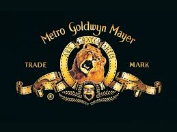
This studio logo for the filming company 'Metro Goldwyn Mayer' is different to some of the others as it emphasizes a different message. The lion in the logo is displayed in the middle, this is to show that the company is highly dominate in the filming industry as lions are dominate in the wilderness. The gold design and writing signifies wealth implying that the company is very wealthy and to be wealthy success must partake meaning that the company is also successful.
It is important that a studio ident says something about the company which all of the studios do due
to the images there logo.

This is the studio logo for one of the six most well known studios called 'Warner Brothers'. As you can see the logo background is in the sky which emphasizes the idea of it being dominate and the best studio as it up in the sky suggesting that its on top and the best motion picture about. The writing and outlining of the logo is written in gold showing making it stand out as it shines from the background giving it an image of opulence and wealth suggesting that the studio is a highly successful company.


This studio is called 'Universal studio' which has been around for 85 years and the logo design has slightly changed as you can see the background color changed and the writing making more simple as it is just 'Universal'. The logo design consists of the world which symbolizes the studio being known worldwide showing that the company is very successful as it is known by a variety of audiences worldwide. The background is in space giving the idea that the studio is out of this world as it is such a good studio showing that it is the best in the world.
This studio is called 'Waltz Design' which is known for making animated and fairy tale based films. This can already be seen in the design logo as you can see the castle in the background of the writing This has a variety of connotations as one of many it can be seen to represents wealth as castles were only owned by the rich suggesting that the company is very wealthy. Castles are also extremely large as they cover a huge amount of land, this displays the idea of the company also being a big with a positive large reputation.
This studio 'Paramount' is also one of the biggest companies in the filming industry which was founded as far back as 1912. Th logo displays a mountain and at the top of the mountain is the company name suggesting that the company is at the top of its what it specializes in which is filming as mountains are really high showing that it is the best around. The background is in the sky also emphasizing the idea of it being on top.
This studio 'Lionsgate' is also a successful filming studio company based in the United States. The logo for this industry is very to logo for 'Paramount' and 'Warner Brothers in the aspect that both background are in the sky signifying the same point of being a successful filming industry and above others in the film field. The writing 'Lionsgate' is then at the middle of the logo in a very simple and basic font but in capitals making it clear and readable to viewers.
This studio logo for the filming company 'Metro Goldwyn Mayer' is different to some of the others as it emphasizes a different message. The lion in the logo is displayed in the middle, this is to show that the company is highly dominate in the filming industry as lions are dominate in the wilderness. The gold design and writing signifies wealth implying that the company is very wealthy and to be wealthy success must partake meaning that the company is also successful.
Subscribe to:
Comments (Atom)